


Blog updated with the most recent Shopify and eCommerce strategies on 05/02/2026.
10 Crucial Steps to Make Your Shopify Store Rock on Mobile Today: The Ultimate Shopify Mobile Optimization Guide
Get this: over 60% of all online shopping will be done on phones by 2025. That means if your Shopify store isn’t perfectly mobile-friendly, you’re leaving serious growth on the table.
Mobile Commerce Stats for 2025: What You NEED to Know
Mobile commerce is set to grab a massive 59% of all retail e-commerce sales in 2025, hitting a staggering $4.01 trillion. This explosion is fueled by more people glued to their smartphones and a huge shift to shopping on the go.
This stat isn’t just a number; it’s a flashing neon sign telling Shopify merchants: mobile optimization is absolutely essential for thriving.
Wondering exactly what you need to do to make your Shopify store a mobile powerhouse? This guide lays out ten game-changing, feature-snippet-ready strategies. We’ll cover everything from nailing mobile responsiveness and picking the perfect theme, to supercharging your images, simplifying navigation, boosting page speed, perfecting your checkout, and setting up ongoing optimization. As your go-to Shopify Plus Partner, BlackBelt Commerce is all about turning these best practices into real, measurable wins for your user experience and your bottom line.
What Exactly Is Mobile-Friendliness and Why Is It a Game-Changer for Your Shopify Store?
Mobile-friendliness means your website feels amazing to use on any smartphone or tablet. It’s the secret sauce that keeps users happy, coming back for more, and ultimately, buying. By designing with mobile in mind, optimizing your assets, and embracing a mobile-first approach, Shopify merchants can jump on the m-commerce wave, slash bounce rates, and climb the search rankings thanks to Google’s mobile-first indexing.
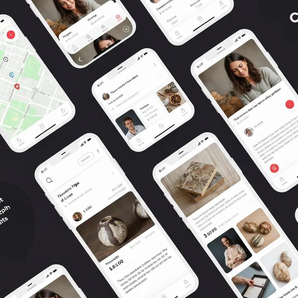
What Does a Mobile-Friendly Shopify Store Look Like?
Think sleek, responsive themes, images that look sharp on any screen, and easy-to-tap interactions. A mobile-friendly Shopify store uses smart design techniques (like CSS media queries and flexible grids) so your menus, product galleries, and checkout forms are crystal clear and a breeze to use, whether someone’s on a tiny phone or a big tablet. Plus, optimized viewport settings ensure browsers display your pages perfectly, ditching the annoying pinch-and-zoom dance and paving a smooth path to purchase.
Wrapping up the responsive design talk, let’s dive into how all this mobile wizardry directly impacts your key metrics: user experience and conversions.
How Does Mobile Optimization Actually Boost Your User Experience and Conversion Rates?
Mobile optimization is all about speed and simplicity. When your pages load lightning-fast and your site is a joy to navigate, users stick around and buy more. We’re talking about cutting down on abandoned carts – a whopping 53% of mobile users bail if a site takes longer than three seconds to load! Even a tiny 0.1-second speed boost can crank up conversion rates by over 8% for retail sites. Add in super-simple menus, easy-to-tap buttons, and streamlined forms, and you’ve got a recipe for more completed orders, bigger average order values, and happier, more loyal customers.
Mobile Conversion Rate: The Numbers You Need to Hit
Typically, mobile e-commerce conversion rates hover between 1.8% and 2.5%. To smash these benchmarks, zero in on blazing-fast page loads, killer user-friendly design, and a checkout process smoother than silk.
This gives you a solid benchmark for your mobile conversion rates and hammers home why optimization is your ticket to better results.
With mobile transactions dominating the e-commerce landscape, adopting a mobile-first mindset isn’t just smart – it’s crucial for long-term success.
Why Is a Mobile-First Design Approach Absolutely Essential for E-commerce Domination?
Mobile-first design flips the script on traditional desktop-focused development. It means building your layouts, interactions, and content with smartphone users as the absolute top priority. Since over 79% of smartphone owners have bought something online using their phone in the last six months, designing features like dynamic product filters and sticky “Add to Cart” buttons with mobile use cases front and center will skyrocket engagement.
Mobile Commerce Stats 2025: Key Insights for Business
A massive 79% of smartphone users have made an online purchase using their mobile device in the past six months, proving just how dominant mobile shopping has become.
This statistic is a powerful reminder: you *must* adopt a mobile-first approach to connect with the vast majority of online shoppers.
Plus, mobile-first strategies actually simplify development. You build a rock-solid mobile foundation first, then layer on desktop enhancements. This focus on progressive enhancement and performance budgets from the get-go aligns perfectly with Google’s Core Web Vitals, ensuring your Shopify store meets both user expectations and SEO demands.
The Undeniable Benefits of a Mobile-First Design Approach in Today’s Mobile-Centric World
Mobile-first design puts the mobile user experience front and center, ensuring websites are perfectly tuned for smaller screens and touch interactions *before* even thinking about desktop versions. This leads to happier users and more time spent on your site.
This really drives home the point: designing with mobile users as your primary audience is key to unlocking a superior user experience.
How Do You Nail the Selection of a Responsive Shopify Theme for Peak Mobile Optimization?
Picking the right responsive theme is the bedrock of all your mobile optimization efforts. A theme built for mobile delivers fluid layouts, crisp retina-ready images, and minimal render-blocking assets, ensuring your store looks and performs flawlessly on every device.
What Are the Must-Have Features of a Mobile-Friendly Shopify Theme?
A top-notch mobile-friendly Shopify theme should boast:
- A fluid grid system that effortlessly adjusts columns and rows to fit any screen size.
- Adaptive images, configured using srcset or Shopify’s built-in settings, to serve the perfect resolution every time.
- Touch-optimized navigation, like slick hamburger menus and full-width buttons that are easy to tap.
- Optimized CSS and JavaScript, with smart lazy loading for non-essential elements.
- A viewport meta tag that tells mobile browsers to render pages correctly at device width by default.
- A minimal number of third-party scripts to keep network requests lean and rendering speedy.
Mobile-Friendly Shopify Themes That Skyrocket User Engagement
A mobile-friendly Shopify theme guarantees that navigating your store on smartphones and tablets is smooth and intuitive, featuring clear, easily accessible menus.
These features create a high-performance foundation, setting you up perfectly for deeper customization down the line.
How Can You Tweak Responsive Shopify Themes for an Even Better Mobile User Experience?
To really dial in your responsive theme:
- Adjust font sizes and line heights specifically for mobile breakpoints to ensure perfect readability.
- Set up sticky headers so your main navigation and search bar are always within easy reach.
- Fine-tune button spacing and set min-width values to meet the recommended 44×44 pixel touch target standard.
- Implement conditional asset loading to smartly defer or ditch non-essential desktop modules on mobile.
- Leverage Shopify Sections to build mobile-specific content blocks – think collapsible accordions for product details – that are perfect for smaller screens.
Mastering these tweaks significantly reduces cognitive load and speeds up the entire mobile browsing and purchasing journey.
Which Shopify Themes Are the Champions of Mobile Performance?
Here’s a quick rundown of four top-tier Shopify themes that absolutely crush it when it comes to mobile responsiveness and speed:
Every one of these themes is built with best practices for fluid grids, optimized images, and deferred assets. Choosing a theme that already has mobile optimizations baked in will make all the subsequent steps in this guide a breeze.
How Can You Optimize Images and Media to Turbocharge Your Shopify Mobile Speed?
Images and media often make up the bulk of your mobile page weight. Compressing and managing them smartly is absolutely critical for hitting those coveted sub-3-second load times.
What Are the Golden Rules for Shopify Mobile Image Compression?
Stick to these compression best practices:
- For photos, export as JPEG at a quality setting of 60–75%.
- For graphics and icons, use PNG-8 or WebP to slash file sizes.
- Automate the process with tools like TinyPNG or use Shopify’s built-in image CDN parameters (like ?width=…&format=webp) for on-the-fly resizing.
- Strip out unnecessary metadata (EXIF, color profiles) when exporting.
- Always set explicit width and height attributes to prevent jarring layout shifts.
Implementing these tips can shrink image file sizes by up to 80% without any noticeable dip in quality.
5 Killer Image Compression Tips for Mobile Design
Image formats like WebP and AVIF offer superior compression, potentially shrinking file sizes by 25–35% compared to JPEG, which is a massive win for mobile site speed.
How Does Lazy Loading Give Your Mobile Page Speed a Serious Boost?
Lazy loading is a clever technique that defers loading images and videos that aren’t immediately visible until they scroll into view. This dramatically cuts down on initial network requests. By adding the attribute to your tags or using Intersection Observer in custom code, your Shopify store can prioritize showing crucial visuals like hero banners and product shots first, while delaying the loading of content further down the page. This strategy slashes initial load times, saves precious mobile data, and gives your Core Web Vitals, like Largest Contentful Paint (LCP), a significant upgrade.
How Can You Minimize the Impact of Media on Mobile Load Times?
Beyond compression and lazy loading, consider these tactics:
- Transform video backgrounds into short, optimized animated GIFs or use CSS shaders.
- Employ responsive srcset attributes so browsers automatically select the best image resolution for the device.
- Host large media files on a Content Delivery Network (CDN) to ensure fast delivery from servers close to your mobile users.
- Limit autoplaying media or only trigger it after user interaction.
- Purge unused media assets and combine multiple small images into CSS sprites for fewer requests.
Every bit of weight you shave off directly translates to faster mobile speeds and better search rankings under Google’s performance guidelines.
How to Optimize Images for Mobile (2024)
For most mobile devices, aim for image widths between 320px and 720px. A sweet spot is around 640px – clear enough for detail, efficient enough for speed.
What Are the Top Strategies for Streamlining Mobile Navigation and User Interface?
A slick, intuitive mobile interface guides shoppers effortlessly from discovery to checkout, cutting down on frustration, reducing cart abandonment, and boosting those all-important conversion rates.
How Do You Design Killer Mobile Menus for Shopify Stores?
Effective mobile menus are:
- Collapsed into an off-canvas sidebar, easily triggered by a clear hamburger icon.
- Equipped with breadcrumb trails on product pages, allowing users to jump back to collections with a single tap.
- Featuring a prominently placed search bar that offers helpful autocomplete suggestions.
- Grouping less critical links (like About Us, Contact) under a “More” section to keep the focus on shopping actions.
- Designed so the sidebar covers no more than 80% of the screen, subtly hinting that it’s closable.
A streamlined menu cuts down on decision fatigue and shortens the path to finding and buying products.
What Mobile UI Elements Are Proven to Boost User Engagement?
Key mobile UI components that make a difference include:
- Sticky “Add to Cart” or “Buy Now” buttons that stay visible as users scroll.
- Micro-interactions like button ripple effects and pull-to-refresh animations that provide satisfying visual feedback.
- Progress indicators that show shoppers how close they are to qualifying for free shipping.
- Tap-friendly accordions for easily digestible product FAQs and specifications.
- Swipeable image galleries that let users explore product photos quickly without page reloads.
These elements actively encourage interaction and reassure shoppers that their mobile journey is smooth and enjoyable.
How Can You Supercharge Your Mobile Checkout Experience to Skyrocket Conversions?

Optimizing your mobile checkout means removing every single hurdle to purchase, making it incredibly easy for shoppers to complete their orders, even when they’re on the go.
What Makes a Shopify Checkout Process Truly Mobile-Friendly?
A mobile-friendly checkout is all about being seamless, secure, and incredibly concise:
- Single-column layouts that present form fields in a clear, vertical flow.
- Automatic country code detection and smart localization for phone number inputs.
- One-touch payment options like Apple Pay and Google Pay for ultimate convenience.
- Persistent cart summaries, perhaps in a slide-out panel, to keep users reminded of their selections.
- Robust SSL encryption and clear security badges to build rock-solid trust.
Boost Conversions with These Mobile Checkout Best Practices
Mobile payments now account for over 70% of all global online transactions, underscoring the critical importance of a perfectly optimized mobile checkout experience.
These features don’t just speed up transactions; they build confidence and encourage completion.
How Do You Implement Mobile-Specific Calls to Action (CTAs) That Convert?
Effective mobile CTAs are:
- High-contrast buttons with clear, action-oriented labels like “Checkout Now” or “Secure Payment.”
- Full-width designs that adapt perfectly to any screen size.
- Incorporating icons (like a shopping cart or credit card) to instantly communicate the action.
- Positioned prominently, ideally above the fold, on key pages like collections and product details.
- Subjected to A/B testing for color, copy, and placement to pinpoint the most effective combinations.
Smart CTA design acts as a clear guide, smoothly ushering users from browsing to buying on their mobile devices.
How Does Mobile Checkout Optimization Directly Impact Conversion Rates?
A streamlined, mobile-optimized checkout can boost conversion rates by a significant 20–30% compared to desktop-first flows. Case studies consistently show that enabling one-touch payments dramatically increases order completion by simplifying form entry. Cutting down checkout steps from five to just three can improve average cart recovery by up to 15%. These improvements translate directly into a higher ROI on your ad spend and a lower cost per acquisition.
How Do You Effectively Test and Monitor Your Shopify Store’s Mobile-Friendliness?
Consistent testing is your secret weapon for catching issues early, driving iterative improvements, and confirming that your optimizations are actually delivering measurable results.
What Are the Top Tools for Testing Shopify Mobile Responsiveness?
Your go-to mobile testing toolkit should include:
- Google Mobile-Friendly Test for quick checks on responsiveness and basic page speed diagnostics.
- Browser Developer Tools (like Chrome DevTools Device Mode) to simulate various screen sizes and network conditions.
- Lighthouse (available in Chrome or via CI pipelines) for comprehensive audits of performance, accessibility, and SEO on mobile.
- BrowserStack or Sauce Labs for testing on actual devices across different operating systems and browsers.
Combining automated checks with real-device testing is the best way to uncover those tricky issues that synthetic tests might miss.
How Can You Use Analytics to Track Mobile Performance and User Behavior?
Get the most out of Google Analytics 4 by setting it up to:
- Segment your traffic by device category (mobile versus desktop).
- Monitor Core Web Vitals metrics (LCP, FID, CLS) within the “Page Speed” reports.
- Track funnel drop-off rates specifically for your mobile checkout process.
- Analyze session recordings and heatmaps by integrating tools like Hotjar.
- Create custom alerts for sudden spikes in mobile bounce rates or slow page loads.
Data-driven insights empower your team to prioritize the fixes that will have the biggest impact.
How Do You Conduct A/B Testing on Mobile Elements for Continuous Improvement?
Effective A/B testing on mobile involves a structured approach:
- Define a single variable to test in each experiment (e.g., CTA color, button text, layout variation).
- Use Shopify’s Draft Orders API or apps like Shopify Plus Scripts to split traffic evenly between variations.
- Run tests for at least 1,000 sessions to ensure statistically significant results.
- Measure both engagement metrics (like click-through rate) and crucial conversion outcomes (like completed purchases).
- Iterate on your winning variations and launch new hypotheses quarterly.
Cultivating a culture of continuous mobile experimentation is the key to driving steady, sustainable growth in your core metrics.
Which Shopify Apps and Integrations Are Essential for Top-Tier Mobile Optimization?
Smartly chosen app integrations can automate repetitive optimization tasks, extend your theme’s capabilities, and fill any performance gaps you might have.
What Kinds of Shopify Apps Are Best for Boosting Mobile Speed and User Experience?
Your essential app categories should include:
- Image Optimization Apps for automatic compression and serving responsive images.
- Lazy Loading Extensions to defer the loading of off-screen media.
- Cache and CDN Boosters to serve cached assets from edge servers closest to your users.
- Mobile UI Enhancers that add features like sticky headers, slide-out carts, and interactive swipe galleries.
- Accelerated Checkout Modules for enabling one-tap payment methods and pre-filled forms.
Always opt for apps with lightweight code and a proven track record to avoid slowing down your site.
How Do You Choose the Right Mobile Optimization Apps for Your Specific Store?
Evaluate potential apps using these criteria:
- Performance Impact: Check Core Web Vitals before and after installing in a test environment.
- User Reviews: Prioritize apps with high ratings and responsive developer support.
- Feature Relevance: Select apps that directly address the specific mobile challenges you’ve identified.
- Support and Updates: Ensure ongoing compatibility with the latest Shopify releases.
- Trial Periods: Validate the benefits through free trials or money-back guarantees.
A disciplined selection process prevents unnecessary bloat and ensures you’re getting the maximum ROI from your app investments.
How Do App Integrations Actually Affect Mobile Performance and User Experience?
While apps offer powerful functionality, each one adds code, network requests, and the potential for conflicts. Careful app auditing – disabling unused scripts and consolidating similar features – is crucial to prevent slowdowns and layout issues. The goal is to harness the power of specialized tools (like image compression, caching, and UI enhancements) without introducing performance bottlenecks.
How Can You Continuously Elevate Your Shopify Store’s Mobile Experience Over Time?
Mobile optimization isn’t a one-and-done task; it’s an ongoing cycle of auditing, gathering feedback, testing, and refining.
What Are the Best Practices for Conducting Regular Mobile Performance Audits?
Maintain a quarterly audit schedule that includes:
- Re-running Lighthouse and PageSpeed Insights reports.
- Confirming that theme updates haven’t introduced new performance issues.
- Checking the load times of third-party scripts and disabling or replacing any underperformers.
- Reviewing Core Web Vitals trends in Google Search Console.
- Performing real-device smoke tests on your critical purchase flows.
Frequent audits are your best defense against regressions and ensure your mobile experience stays sharp and aligned with current standards.
How Can You Leverage User Feedback and Analytics for Smarter Mobile UX Enhancements?
Actively collect and act on direct customer input:
- Use on-site surveys or chatbots to ask mobile shoppers about their pain points.
- Dive into session recordings to pinpoint navigation bottlenecks.
- Monitor support tickets and contact forms for recurring device-specific issues.
- Cross-reference feedback with analytics to prioritize fixes that matter most (e.g., slow collection pages versus confusing menu labels).
A roadmap driven by user feedback ensures your enhancements are addressing real shopper needs.
When and How Should You Revamp Your Mobile Optimization Strategy?
Trigger a strategic review when:
- Shopify rolls out major theme updates or new performance APIs.
- Google adjusts its Core Web Vitals thresholds.
- Your store undergoes significant design or feature overhauls.
- You’re expanding into new markets with different mobile usage patterns.
- Your analytics show a downward trend in mobile conversions or speed metrics.
During each review, re-evaluate your priorities, explore new technologies (like advanced image formats), and update your roadmap to maintain your competitive edge.
Delivering a flawless mobile shopping experience is a blend of smart responsive design, performance engineering, intuitive UX, data-driven testing, and relentless iteration. By mastering these ten essential steps – from choosing the right theme and optimizing images to streamlining navigation, boosting speed, perfecting checkout, testing rigorously, integrating smart apps, and auditing consistently – your Shopify store will captivate mobile visitors, drive conversions, and absolutely thrive under Google’s mobile-first indexing. Need expert help implementing these strategies at scale? Reach out to BlackBelt Commerce, your trusted Shopify Plus Partner, and let’s transform your mobile traffic into serious revenue.
Quick Answer: mobile friendly Shopify store
Mobile Friendly Shopify Store should help merchants make a clearer decision about their store, customer experience, and growth priorities. A useful guide explains the concept, shows when it matters, and gives the reader a practical next step without forcing the topic into a generic template.
Key Takeaways
- Start with the search intent behind mobile friendly Shopify store: the reader needs a clear explanation before they are ready for a service conversation.
- Keep the advice practical and specific so the post feels editorial, useful, and worth sharing.
- Use the topic cluster links to connect the article to related BBC expertise instead of leaving it as a standalone blog post.
- Add a natural commercial bridge only after the article has answered the reader’s main question.
- Use the same-page Calendly CTA so qualified readers can book a strategy call without being sent to a long form.
How this connects to your Shopify growth strategy
This article should remain useful for readers researching mobile friendly Shopify store, but it also needs to show when the topic becomes a business decision. For the Shopify Growth and Store Optimization cluster, the commercial bridge is practical: once the reader understands the concept, the next step is deciding whether their current Shopify setup can support the desired experience, conversion path, and operational workflow. That is where expert planning, design, development, CRO, and SEO support can turn the idea into measurable store improvements.
Related Shopify resources
These internal resources support the Shopify Growth and Store Optimization topic cluster and help connect this guide to stronger commercial next steps:
- Shopify Growth and Store Optimization
- Shopify experts
- Shopify Plus agencies
- Shopify Growth and Store Optimization — Parent service page for the reader’s next commercial step
- Blackbelt Commerce — Home-page authority link for brand and core Shopify expertise
- Shopify Plus agencies — Money-page link requested for high-growth and Plus-agency intent
- Shopify custom development — Development service page for implementation and technical help
- Shopify CRO — Conversion service page for readers focused on revenue and lead generation
- Shopify landing page design — Related design and conversion article for custom storefront decisions
- custom e-commerce solution — Related custom ecommerce article that supports build-vs-template decisions
Questions store owners ask before taking action
What does mobile friendly Shopify store mean for a Shopify merchant?
For a Shopify merchant, mobile friendly Shopify store is about choosing or improving the store experience in a way that supports traffic, trust, conversion, and long-term operations.
When should a store owner get expert help?
Expert help becomes useful when the decision affects SEO, conversion, theme architecture, integrations, migration risk, or revenue-critical customer journeys.
How should this topic connect to a broader content cluster?
The post should link to a parent service page, related support articles, and money pages so Google and AI systems understand how the article supports a broader area of expertise.
What is the lead-generation goal of this article?
The article should educate first, then guide qualified readers toward booking a strategy call when they need help applying the advice to their own store.
What should be avoided during optimization?
Avoid filler, unrelated phrases, invented statistics, broken formatting, duplicated CTAs, and any edit that makes the article feel less helpful or less polished.
Future articles needed for topical dominance
To build deeper topical authority around this cluster, these supporting topics should be created later and linked back into this article:
- Mobile Friendly Shopify Store Checklist for Shopify Store Owners: Creates a practical support article that turns the Shopify Growth and Store Optimization topic into an actionable review tool.
- Common Mobile Friendly Shopify Store Mistakes and How to Avoid Them: Captures problem-aware searches and gives BBC a natural place to explain implementation risks without hard selling.
- When to Hire Shopify Experts for Mobile Friendly Shopify Store: Connects informational demand to the expert-hiring money page while preserving educational intent.
