

Sometimes it’s hard to know what to look for when choosing a theme. Which one will my customers like? What’s going to make me the most sales? Next, I will outline three important features of a theme which impact directly on your sales, based on hundreds of hours of usability research.
1. Where can I give you my money? – Also known as no “item added to cart” message
A customer clicks “Add to cart”. So far so good. They want to give you money. But when they click it, nothing happens. There’s no obvious message, button or link to the next step. This website doesn’t get what I’m doing. Sighing, your almost-customer goes back to Google to look for a competitor.
What happened?
When they clicked “Add to cart”, the item was added to their cart in the background, but they weren’t told about it, other than a small “1” appearing next to a cart icon. Through testing hundreds of web users, I learned that most people don’t know (or want to know) how your backend works, and they’re too impatient to look for icons or hints. They don’t want to search for a small button saying “Check out”. They want to be told, up front, in no uncertain terms, what the next step is.
Lesson: When selecting/using a theme, make it very obvious when an item is added to the cart.
Good example:
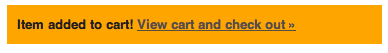
This gives a clear direction of what to do next.
***
Not-so-good example:
Asking the customer to notice and click this up the top right of their screen

***
2. If it looks like an ad…
People using the interwebs are generally very suspicious of anything that looks like an advertisement, marketing banner, or otherwise sales-y image. I’ve seen hundreds of people scan over what seems to be an “obvious”, big, fat image, simply because it looked like an ad, and they ignored it.
Let’s pretend you want to attend a conference. Would you click:
This ↓

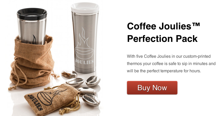
or this ↓?

If you chose option #2, you’d be with the vast majority. Most of us tend to ignore flashy banners instinctively.
Lesson: If you’re going to use big images, make them simple and non-spammy. Put a button or text link on top of the image: many more people will look at this than they will your big image if it looks like an ad.
This is why Google works so well: people are less suspicious of text ads than they are of big, flashy images.
A great example:
3. You can only see, what you can see (also known as: don’t make people scroll for the important stuff)
Ever visited a website and thought, “where’s that product I wanted”? After 20 seconds looking left and right, you scroll down to find what you wanted, hidden below the screen (also known as the “fold”).
Lesson: Make the most important elements visible without scrolling (place them above the “fold”), especially on your home page. In particular, think about “Buy Now” buttons and your contact details on the “Contact” page. Make sure they’re visible to your customers can give you money or contact you.
Here’s an example of what I saw on one website when I came to the home page:

I’m not perfect myself and have made more than my share of mistakes when designing and reviewing. I’m sharing these blunders so you don’t have to make them ☺
Side note: Of course, not everything can go above the page fold, right? I’m not suggesting you try to cram as much as possible up the top of your pages, making them too messy to digest. I’d simply recommend prioritizing, and putting the most important parts where people expect to find them.
General Guidelines:
-
Above the fold: Main menu, buy now buttons, contact information, links to products or categories, snippet “About Us” information, videos (if the message is important).
- Below the fold: Social media links, related products, footnotes, disclaimers, guarantees, newsletter subscriptions, asking for anything from the customer.
***
Credits:
- Screenshot of “Good” add to cart message: Radiance Theme, as seen on Eco Gadget Covers Shopify Store
- Screenshot of “Good” example of a banner: Coffee Joulies Shopify Store
***
Thank you for checking out our Shopify Insider Blog @ Blackbelt Commerce, we have many other valuable and informative posts that you will help you to continue to optimize your websites such as What We Learned From Our Rebrand, Paypal versus other gateways on shopify, The ultimate guide on your best shopify Apps, and Media Gallery For Shopify. Please check out our other products
Questions? Please let us know in the comments below.