


A $3.2M accessories brand came to us last fall with a conversion rate problem. They’d been adding to the store for three years straight — a countdown timer here, a sticky add-to-cart bar there, a social proof widget, an upsell popup, a loyalty badge, a chatbot. Their product page had eleven distinct moving elements. Their conversion rate was 1.1%. Industry average for their category was closer to 2.4%.
We ran the audit. We didn’t add a single thing. We removed seven. Conversion rate climbed to 2.6% inside six weeks.
TL;DR: Our last five biggest CRO wins on Shopify came from subtraction, not addition. The pattern: cluttered stores signal brand uncertainty, and uncertain brands don’t convert. Brand discipline — the willingness to remove anything that dilutes the core message — is a direct conversion lever, not an aesthetic preference.
The Thesis
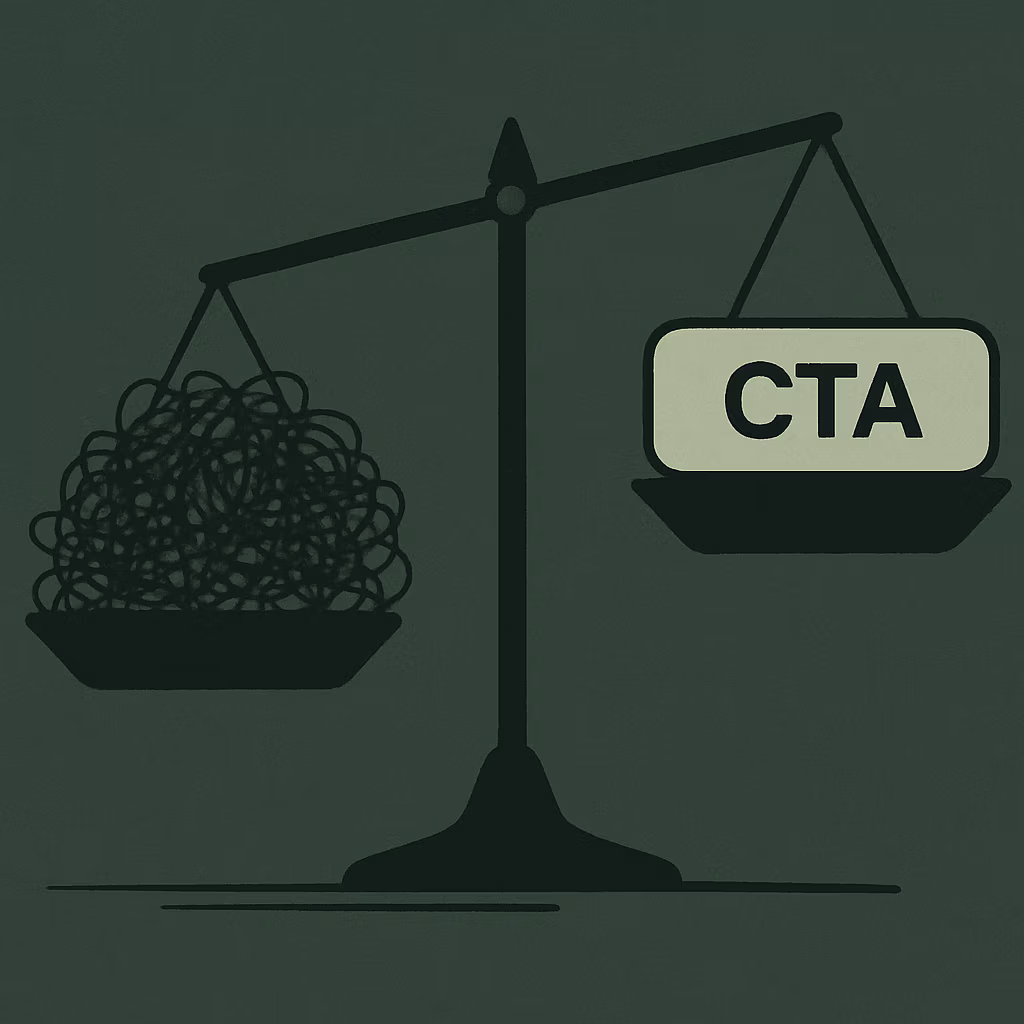
Most CRO advice is additive. Add urgency. Add social proof. Add upsells. Add friction-reducers. And some of that is valid — but it’s valid only on a clean foundation. What we’ve found, across hundreds of Shopify engagements, is that cluttered stores don’t convert because they don’t communicate a clear reason to buy. The noise overwhelms the signal. Every element you add is a new demand on the customer’s attention. When you’ve demanded too much, they leave. Brand discipline — the practice of removing anything that doesn’t directly serve the purchase — is the most underused conversion lever in ecommerce.
Win 1: The Accessories Brand and the 11-Element Product Page
What does element overload actually do to conversion?
When a product page has eleven competing visual elements, none of them wins. The browser’s eye doesn’t know where to go, so it goes nowhere — and “nowhere” on a product page means back to Google. The accessories brand we mentioned above had added every conversion “trick” their growth consultant recommended over a three-year period. Each addition made sense in isolation. Together, they created a page that felt like a trade show booth staffed by eleven people all talking at once.
We removed the countdown timer (fabricated urgency their customers had learned to ignore), the chatbot (average response time was 18 hours — it was creating frustration, not support), two badge stacks that contradicted each other, a sticky bar that obscured the size selector on mobile, and two trust widgets that loaded slowly enough to visibly delay the page. What remained: product imagery, a clean title and price, a single clear CTA, three concise bullet points on fit and materials, and reviews. The page felt like a brand that knew what it was. Conversion rate went from 1.1% to 2.6% in six weeks.
Win 2: Metro School Uniforms and the Category Page Collapse
Why do too many filters hurt a focused buyer?
Too many filters create decision paralysis for buyers who already know what they want. When a buyer arrives with intent, excessive optionality is friction — not help. Metro School Uniforms, a national leader in school uniform programs for schools and districts across the country, had a category page architecture that had grown to accommodate every possible edge case. Forty-two filter options. Seven sort modes. A sidebar that took up 30% of the viewport on desktop and collapsed into an unusable drawer on mobile.
Their buyers are parents and school administrators. They know the school. They know the grade. They need polo shirts in navy, size 8. They don’t need forty-two ways to slice a product catalog. We collapsed the filter architecture down to six options — gender, size, color, school, category, and price — removed the sort modes that logged zero usage in six months of session data, and cleaned up the sidebar to a single column. Page-to-PDP click-through went up 34%. Organic traffic was already climbing at the time — up 138.7% year-over-year across the engagement — but the category page work directly contributed to the conversion lift that made that traffic meaningful.
Win 3: The $1.8M Home Goods Brand and the Homepage Hero Carousel
When does a hero carousel hurt more than it helps?
A hero carousel hurts when it turns a brand’s single strongest message into a sequence of competing ones. The first slide wins. Every slide after it dilutes it. A $1.8M home goods brand we worked with in late 2025 had a five-slide homepage carousel. Slide 1: seasonal sale. Slide 2: brand story. Slide 3: new arrivals. Slide 4: sustainability commitment. Slide 5: free shipping offer. Five different answers to the question “why should I care about this brand” — delivered in a format most users never see past slide one anyway.
We replaced it with a single static hero. One image. One headline. One supporting line. One CTA. The creative team spent two days debating which message to keep. That debate was the most valuable CRO work we did on that engagement, because it forced the brand to decide what it actually was. Bounce rate on the homepage dropped 19%. Average session depth increased by 1.4 pages. When you make a brand choose one thing to say, the brand gets clearer — and clearer brands convert.
Win 4: The Supplement Brand and the Checkout Trust Badge Overload
Can too much trust signaling undermine trust?
Yes — when the volume of trust signals suggests the brand is trying too hard, it raises a question in the buyer’s mind: why does this brand need to work this hard to convince me? A supplement brand doing roughly $2.4M annually had loaded their checkout with nine trust badges. Money-back guarantee. SSL secure. GMP certified. PayPal verified. NSF certified. BBB accredited. McAfee secured. Satisfaction guaranteed. 3rd-party tested. Nine badges stacked in two rows, taking up significant visual real estate just above the “Complete Order” button.
We audited their actual customer objections through post-purchase surveys and support ticket analysis. Two concerns dominated: ingredient sourcing and return policy clarity. Everything else was noise. We cut seven badges and replaced them with two lines of plain text: a single sentence on their sourcing standards, and a single sentence on their no-questions-asked 30-day return policy — linked to the full policy page. Checkout completion rate improved by 11% in the first month. The lesson isn’t that trust doesn’t matter. The lesson is that trust has to be specific to convert. Generic trust badges are decoration. Specific answers to real objections are conversion tools.
Win 5: The Fashion Brand and the Navigation Sprawl
How does navigation complexity affect time-to-purchase?
Navigation complexity increases time-to-purchase directly — and for fashion, where impulse and aesthetic resonance drive buying decisions, slowing someone down is often enough to lose them. A fashion brand at $4.1M in revenue had grown their navigation menu to reflect their internal product taxonomy rather than their customer’s mental model. Eight top-level categories. Eighteen subcategories. A “New Arrivals” and a “What’s Hot” and a “Featured” section that often showed the same products under different labels.
We rebuilt the navigation around four questions their customers actually ask: What’s new? What’s on sale? What do I need for [occasion]? What’s the brand about? Four top-level nodes. Clean dropdown maximum of six items per node. “What’s Hot,” “New Arrivals,” and “Featured” collapsed into a single “New In” node. The navigation rebuild took one week. Time-to-first-product-click on mobile dropped by 22%. Add-to-cart rate went up. This is worth noting in the context of Shopify Plus checkout customization — you can do sophisticated work at the checkout level, but if the navigation above it creates confusion, you’re optimizing the last 10% while leaving the first 90% broken.
The Objection: “You Need Social Proof and Urgency to Convert”
Some CRO consultants will tell you that urgency triggers and social proof widgets are table stakes — that removing them is leaving money on the table. There are A/B test screenshots to back this up. Popups that lifted conversions 18%. Countdown timers that cut cart abandonment. We’ve seen those screenshots too.
Here’s what those tests don’t show: the baseline they were run against. Almost every “urgency widget adds 18% conversion” test is run against a store that already had mediocre conversion rates for foundational reasons — weak photography, unclear hierarchy, slow load times, confusing navigation. Adding an urgency widget to a broken store can mask the problem while generating a marginal lift. It doesn’t fix the foundation. When we rebuild the foundation — clarity, hierarchy, speed, brand coherence — the “added” urgency widget frequently shows no meaningful lift, because the store is already converting on the strength of its own signal.
We’re not anti-social proof. We’re anti-noise. Reviews, placed correctly, convert. Seventeen badge stacks and an animated “14 people viewing this right now” ticker placed directly on top of your hero image do not. The distinction matters. Founders who learn to see the difference stop chasing CRO tactics and start building stores that convert because they’re clear — and clear stores don’t need to be loud.
What to Do About It Monday Morning
These five moves cost nothing and take less than a day to implement:
1. Count the elements on your product page. Open your best-selling product page on mobile. Count every distinct moving or interactive element. If you have more than five, you have clutter. Start there. Ask what each element is answering — if the answer is “just in case,” cut it.
2. Run a filter audit on your highest-traffic category page. Pull six months of session data. Sort your filter usage by frequency. If more than 40% of your filters have near-zero usage, remove them. You’re not helping the edge case buyer — you’re confusing the core buyer.
3. Replace your carousel with a static hero — even temporarily. Pick one message. The creative tension of choosing forces brand clarity. Run it for 30 days and check homepage bounce rate and session depth against your historical baseline.
4. Audit your checkout trust badges against actual customer objections. Pull your last 30 support tickets and your last 50 post-purchase survey responses if you have them. What do customers actually doubt? Answer those two things in plain language. Remove everything else.
5. Rebuild navigation around customer questions, not your SKU taxonomy. Ask yourself: what are the four questions a first-time visitor would ask before buying from this store? Build your top-level navigation nodes around those four answers. The right Shopify partner should be pushing you toward this kind of structural thinking, not just executing what you already decided.
The Close
Every element you add to a store is an argument you’re making to the customer. “Trust me because of this badge.” “Buy now because of this timer.” “Care about this because of this popup.” When you make too many arguments at once, the customer hears none of them. What they hear is noise. What noise signals is uncertainty. Uncertain brands don’t convert — not because of their conversion rate tactics, but because they haven’t decided what they are.
Brand discipline isn’t a design philosophy. It’s a business decision. The founders who understand this stop asking “what should we add?” and start asking “what are we willing to remove?” That’s the harder question. It’s also the one that moves the number. If you’re deep in the weeds on A/B testing tactics but haven’t done a subtraction audit in the last six months, you’re optimizing decoration while the foundation stays cluttered — and no amount of checkout-level optimization fixes a store that loses people before they get there.
FAQ
How do you know which elements to remove first?
Start with elements that have no measurable usage data behind them — anything that was added based on a consultant’s recommendation or an industry “best practice” without being tested against your specific audience. On product pages, prioritize removing anything that competes visually with the primary CTA or obscures product imagery. The question to ask for each element is: does this directly help a ready buyer complete their purchase, or does it serve some other goal? If it’s the latter, it’s a candidate for removal.
Won’t removing urgency signals hurt my conversion rate?
Not if your store’s conversion problem is rooted in clarity rather than urgency. Urgency signals work when a buyer is already convinced and just needs a push. When a buyer isn’t convinced yet, urgency feels manipulative and accelerates their exit. If you’re running urgency tactics on a store with weak product photography, confusing navigation, or a cluttered product page, you’re applying pressure before you’ve earned trust — and that combination rarely converts. Fix the foundation first, then test urgency in targeted, honest applications like genuine low-stock warnings.
How long does it take to see results from a subtraction-focused CRO audit?
Most of the wins we’ve described showed measurable movement within four to six weeks of implementation — which is faster than most addition-based CRO tests, because you’re removing friction rather than introducing a new variable that needs time to accumulate statistical significance. The biggest variable is traffic volume. Stores doing above $50K/month in revenue have enough session volume to see meaningful data within two to three weeks. Below that threshold, give it six to eight weeks before drawing conclusions.
Does this approach work for stores that sell a wide range of SKUs?
Yes — and it’s especially important for high-SKU stores, where the temptation to build “discovery” features (mega-menus, layered filters, recommendation carousels) is strongest. The principle scales: every layer of discovery architecture you add assumes the customer doesn’t know what they want. Many of them do. Optimize first for the buyer with intent, then layer in discovery features only where session data confirms customers are actually using them to find and purchase products.
{
“@context”: “https://schema.org”,
“@type”: “Article”,
“headline”: “Why Subtraction Is Our Best CRO Tool”,
“description”: “Our last 5 biggest CRO wins on Shopify came from removing things — not adding them. Here’s what we cut, what it changed, and the brand discipline thesis behind it.”,
“author”: {“@type”: “Person”, “name”: “Cesar Beltran”, “url”: “https://www.blackbeltcommerce.com/about”},
“publisher”: {“@type”: “Organization”, “name”: “Blackbelt Commerce”, “url”: “https://www.blackbeltcommerce.com”, “logo”: {“@type”: “ImageObject”, “url”: “https://www.blackbeltcommerce.com/wp-content/uploads/blackbelt-logo.png”}},
“datePublished”: “2026-06-03”,
“dateModified”: “2026-06-03”,
“mainEntityOfPage”: {“@type”: “WebPage”, “@id”: “https://www.blackbeltcommerce.com/?p=17313”},
“keywords”: “Shopify CRO conversion optimization, brand discipline, product page optimization, Shopify conversion rate, ecommerce CRO audit, subtraction CRO”,
“articleSection”: “Editorial”,
“wordCount”: 2100
}
{
“@context”: “https://schema.org”,
“@type”: “FAQPage”,
“mainEntity”: [
{“@type”: “Question”, “name”: “How do you know which elements to remove first?”, “acceptedAnswer”: {“@type”: “Answer”, “text”: “Start with elements that have no measurable usage data behind them — anything that was added based on a consultant’s recommendation or an industry best practice without being tested against your specific audience. On product pages, prioritize removing anything that competes visually with the primary CTA or obscures product imagery. The question to ask for each element is: does this directly help a ready buyer complete their purchase, or does it serve some other goal? If it’s the latter, it’s a candidate for removal.”}},
{“@type”: “Question”, “name”: “Won’t removing urgency signals hurt my conversion rate?”, “acceptedAnswer”: {“@type”: “Answer”, “text”: “Not if your store’s conversion problem is rooted in clarity rather than urgency. Urgency signals work when a buyer is already convinced and just needs a push. When a buyer isn’t convinced yet, urgency feels manipulative and accelerates their exit. If you’re running urgency tactics on a store with weak product photography, confusing navigation, or a cluttered product page, you’re applying pressure before you’ve earned trust — and that combination rarely converts. Fix the foundation first, then test urgency in targeted, honest applications like genuine low-stock warnings.”}},
{“@type”: “Question”, “name”: “How long does it take to see results from a subtraction-focused CRO audit?”, “acceptedAnswer”: {“@type”: “Answer”, “text”: “Most of the wins we’ve described showed measurable movement within four to six weeks of implementation — which is faster than most addition-based CRO tests, because you’re removing friction rather than introducing a new variable that needs time to accumulate statistical significance. The biggest variable is traffic volume. Stores doing above $50K/month in revenue have enough session volume to see meaningful data within two to three weeks. Below that threshold, give it six to eight weeks before drawing conclusions.”}},
{“@type”: “Question”, “name”: “Does this approach work for stores that sell a wide range of SKUs?”, “acceptedAnswer”: {“@type”: “Answer”, “text”: “Yes — and it’s especially important for high-SKU stores, where the temptation to build discovery features like mega-menus, layered filters, and recommendation carousels is strongest. The principle scales: every layer of discovery architecture you add assumes the customer doesn’t know what they want. Many of them do. Optimize first for the buyer with intent, then layer in discovery features only where session data confirms customers are actually using them to find and purchase products.”}}
]
}

