


Over half of American shoppers now use their phones to browse and buy online, placing fresh demands on every digital storefront. As mobile devices reshape the way people explore and purchase products, responsive ecommerce design has become essential for reaching and retaining customers. By mastering how your store adapts to different screens, you unlock the ability to deliver seamless, satisfying shopping experiences for every visitor.
Table of Contents
- Responsive Ecommerce Design Defined Clearly
- Device Compatibility and Adaptive Principles
- Key User Experience Factors for Ecommerce
- Successful Shopify-Focused Responsive Strategies
- Common Pitfalls and Optimization Mistakes
Key Takeaways
| Point | Details |
|---|---|
| Responsive Design | Effective ecommerce websites use responsive design to ensure optimal user experience across various devices. This involves creating adaptable layouts that maintain functionality and aesthetics. |
| Device Compatibility | Implement adaptive design strategies to enhance compatibility across devices, ensuring layouts and elements adjust seamlessly based on screen size and resolution. |
| User Experience Focus | A successful ecommerce platform prioritizes user experience through intuitive navigation, fast load times, and effective product presentation to drive engagement and conversions. |
| Ongoing Optimization | Constantly refine and test responsive designs to address evolving user expectations and technological changes, avoiding common pitfalls that hinder performance. |
Responsive Ecommerce Design Defined Clearly
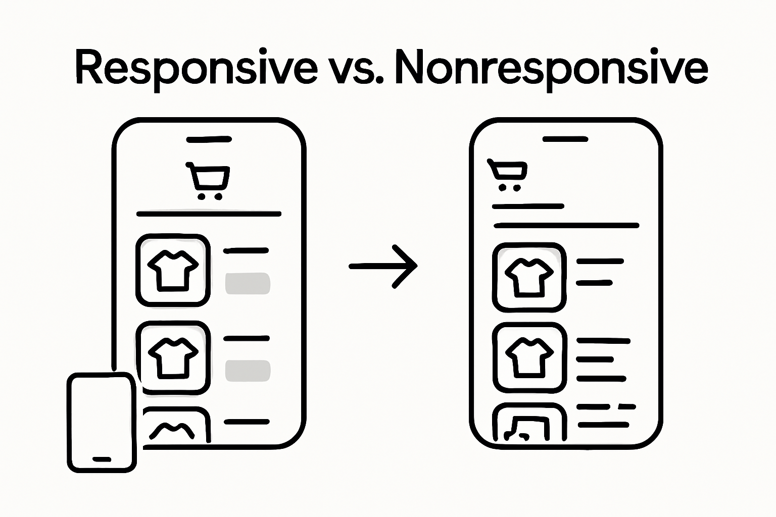
Responsive ecommerce design represents a strategic approach to creating digital storefronts that dynamically adapt across multiple devices and screen sizes. At its core, responsive web design transforms how online stores present their products and engage potential customers by ensuring seamless visual and functional experiences from smartphones to desktop computers.
The fundamental principle of responsive design centers on creating flexible web layouts that automatically resize, reposition, and rescale content to match the specific viewing environment. By utilizing advanced techniques like fluid grid systems, flexible image scaling, and CSS3 media queries, ecommerce websites can maintain optimal readability and navigation regardless of screen dimensions. These technical strategies allow product images, text blocks, and purchase buttons to intelligently adjust without compromising user experience or visual aesthetic.
Key characteristics of effective responsive ecommerce design include:
- Fluid Layout Grids: Proportional sizing that maintains design integrity across devices
- Flexible Media: Images and videos that scale smoothly without pixelation
- Adaptive Navigation: Menus and buttons that restructure for touch and click interactions
- Performance Optimization: Fast loading times across different network speeds
Ultimately, responsive design transforms how online stores connect with customers by removing technical barriers and creating intuitive, accessible shopping experiences that feel natural on any device.
Device Compatibility and Adaptive Principles
Device compatibility represents a critical strategy for modern ecommerce websites, ensuring optimal user experiences across diverse digital platforms. Adaptive web design techniques enable online stores to dynamically adjust their visual presentation and functionality based on the specific characteristics of each user’s device.

The core principle of device compatibility involves creating flexible digital environments that seamlessly transform across different screen sizes, resolutions, and interaction modes. By implementing responsive design principles, ecommerce platforms can intelligently reconfigure page layouts, resize images, and restructure navigation elements to maintain a consistent and engaging user experience whether customers are browsing on smartphones, tablets, laptops, or desktop computers.
Key adaptive design strategies include:
- Breakpoint Management: Defining specific screen width ranges where layout adjustments occur
- Fluid Grid Systems: Using percentage-based sizing instead of fixed pixel dimensions
- Flexible Media Queries: Dynamically applying CSS rules based on device characteristics
- Touch-Friendly Interface Elements: Ensuring buttons and interactive components work across different input methods
Successful device compatibility goes beyond simple resizing. It requires a holistic approach that considers user context, interaction preferences, and technical constraints to deliver a seamless, intuitive shopping experience that feels native to each individual device.
Key User Experience Factors for Ecommerce
User experience represents the cornerstone of successful online retail, directly impacting customer engagement, satisfaction, and conversion rates. Optimizing ecommerce strategies requires a holistic approach that considers every interaction point between customers and digital storefronts, from initial page load to final checkout process.
A well-designed responsive ecommerce platform transforms user interactions by eliminating friction and creating intuitive navigation pathways. Improving customer experience goes beyond visual aesthetics, focusing on creating seamless, predictive interfaces that anticipate and fulfill user needs with minimal effort. Responsive design ensures that critical elements like product descriptions, images, and purchase buttons adapt dynamically across devices, maintaining readability and accessibility.
Critical user experience factors include:
- Intuitive Navigation: Clear, logical menu structures that help users find products quickly
- Fast Load Times: Optimized images and minimal scripts to reduce waiting periods
- Mobile Responsiveness: Seamless experiences across smartphones, tablets, and desktops
- Clear Product Information: Comprehensive, easily digestible details about products
- Simplified Checkout Process: Minimal steps and multiple payment options
Successful ecommerce platforms understand that user experience is an ongoing journey of continuous refinement, requiring consistent analysis, testing, and adaptation to evolving customer expectations and technological capabilities.
Successful Shopify-Focused Responsive Strategies
Shopify store owners face unique challenges in creating responsive designs that not only look compelling but also drive meaningful conversions. Shopify design strategies require a nuanced approach that balances aesthetic appeal with functional performance across multiple device types and user interaction models.
Successful responsive design for Shopify stores hinges on understanding platform-specific limitations and opportunities. Optimizing store redesign processes involves strategic implementation of flexible themes, intelligent layout frameworks, and performance-focused development techniques that prioritize user experience without compromising loading speed or visual consistency.
Key strategies for Shopify-specific responsive design include:
- Mobile-First Theme Selection: Choosing themes with inherent responsive capabilities
- Performance Optimization: Minimizing script and image load times
- Dynamic Product Visualization: Ensuring product images scale seamlessly across devices
- Simplified Navigation: Creating touch-friendly menu structures
- Streamlined Checkout Flow: Reducing friction in mobile purchasing processes
Ultimately, responsive design for Shopify stores is an ongoing process of testing, refinement, and adaptation, requiring continuous monitoring of user behavior, technological trends, and conversion metrics to maintain a competitive digital storefront.
Common Pitfalls and Optimization Mistakes
Responsive ecommerce design demands precision, and even minor oversights can significantly impact user experience and conversion rates. Best practices for store optimization reveal that many Shopify store owners inadvertently undermine their digital storefronts through common design and performance missteps.
Most responsive design failures stem from a lack of comprehensive testing and a narrow understanding of user interaction across diverse devices. Store redesign strategies emphasize the importance of holistic approach that considers not just visual aesthetics, but also functional performance, loading speed, and intuitive navigation across smartphones, tablets, and desktop environments.
Critical optimization mistakes to avoid include:
- Image Overload: Using high-resolution images that dramatically slow page loading
- Unoptimized Mobile Menus: Complex navigation structures that frustrate touch interactions
- Inconsistent Typography: Font sizes and styles that break responsiveness
- Neglecting Touch Targets: Buttons and links too small for mobile finger interactions
- Complex Checkout Processes: Multi-step forms that increase abandonment rates
Successful responsive design requires continuous refinement, acknowledging that digital user expectations evolve rapidly and what works today might become obsolete tomorrow.
Unlock the Power of Responsive Ecommerce Design to Boost Your Shopify Store Conversions
Are you struggling with slow loading times, clunky mobile navigation, or inconsistent product displays that drive away customers? Responsive ecommerce design is essential to create seamless shopping experiences on every device with fluid layouts, adaptive navigation, and performance optimization. Blackbelt Commerce specializes in solving these exact pain points by delivering custom Shopify solutions tailored to your brand’s unique needs. We understand that optimizing user experience requires more than just resizing pages—it means refining checkout flows, enhancing image scaling, and simplifying menus for touch interaction.
Take your Shopify store to the next level today by partnering with experts who know how to transform responsive design theory into measurable growth. Explore our proven strategies and client success stories at Blackbelt Commerce. Learn more about our Shopify Store Redesign Process Guide and discover More Shopify Design Strategies to create a fast, intuitive, and conversion-focused online storefront. The time to act is now to ensure your ecommerce platform delivers an engaging, device-compatible experience that turns visitors into loyal customers.
Frequently Asked Questions
What is responsive ecommerce design?
Responsive ecommerce design is a strategic approach to creating online stores that automatically adapt to various devices and screen sizes, ensuring seamless visual and functional experiences for users.
How does responsive design improve user experience on e-commerce sites?
Responsive design enhances user experience by providing intuitive navigation, fast load times, and accessible product information across different devices, which can lead to increased customer satisfaction and higher conversion rates.
What are key characteristics of effective responsive ecommerce design?
Key characteristics include fluid layout grids, flexible media, adaptive navigation, and performance optimization to ensure a consistent user experience on any device.
What common mistakes should be avoided in responsive ecommerce design?
Common mistakes include using high-resolution images that slow down load times, unoptimized mobile menus, inconsistent typography, neglecting touch targets, and complex checkout processes that can deter customers.
Recommended
- Why Optimize Ecommerce Stores: Complete Guide – Shopify Experts: Grow Your eCommerce Revenue
- High converting websites: Master 5 Pillars
- Maximize Conversions: E-Commerce Optimization Tips
- How to Increase Shopify Conversions: Proven Step-by-Step Guide – Shopify Experts: Grow Your eCommerce Revenue
- Top Classic Fragrance Dupes – Expert Comparison 2025
Quick Answer: Responsive ecommerce design
Responsive ecommerce design should improve how a Shopify store converts traffic into trust, customers, and revenue. The article should connect UX, store features, security, automation, performance, analytics, and conversion paths so readers understand what to fix and when expert help can accelerate results.
Want a sharper Shopify growth plan?
Want to turn Responsive ecommerce design into a practical Shopify growth plan? Book a strategy call and we will help you clarify the next move.
Key Takeaways
- Use Responsive ecommerce design to clarify the business problem and the highest-impact next step for a Shopify store.
- Connect recommendations to customer trust, UX, conversion, SEO, analytics, operations, and revenue.
- Link naturally to Blackbelt Commerce money pages and the home page without weakening editorial trust.
- Avoid generic ecommerce advice; make the guidance specific to Shopify constraints and opportunities.
- Use the same-page Calendly CTA only after the post has delivered useful guidance.
How this connects to your Shopify growth strategy
For the Shopify Growth, CRO, and Store Optimization cluster, this article should make Responsive ecommerce design practical, specific, and commercially useful while protecting editorial trust. The bridge to Blackbelt Commerce should show when expert planning, implementation, SEO/CRO discipline, or Shopify Plus support can reduce risk and turn the reader’s next decision into measurable progress.
Want a sharper Shopify growth plan?
Use this guide as a decision tool. Then book a strategy call when you want a practical roadmap for your store.
Related Shopify resources
These internal resources support the Shopify Growth, CRO, and Store Optimization topic cluster and help connect this guide to stronger commercial next steps:
- Shopify CRO services
- Shopify experts
- Shopify Plus agencies
- Shopify CRO services — Primary money/service page for this search intent
- Blackbelt Commerce — Home-page authority link for brand and core Shopify expertise
- Shopify experts — Money-page link requested for expert-hiring intent
- Shopify custom development — Development service page for implementation and technical help
- Shopify checkout optimization — Related conversion article
- Shopify conversion optimization — Related CRO article
Questions store owners ask before taking action
Why does Responsive ecommerce design matter for Shopify merchants?
It matters when the topic affects customer trust, conversion, operations, SEO, analytics, or the team’s ability to scale the store cleanly.
How should the article guide the reader?
It should answer the search intent first, then connect the topic to practical next steps, related resources, and expert support when that next step is useful.
What is the lead-generation goal?
The goal is a qualified strategy-call booking after the article has delivered enough value for the reader to trust Blackbelt Commerce with the next decision.
Future articles needed for topical dominance
To build deeper topical authority around this cluster, these supporting topics should be created later and linked back into this article:
- Responsive ecommerce design Checklist for Shopify Stores: Creates an actionable support article that can earn long-tail searches and link back to relevant money pages.
- Common Responsive ecommerce design Mistakes That Hurt Shopify Revenue: Targets problem-aware readers and explains UX, SEO, conversion, and implementation risk.
- How Shopify Experts Prioritize Responsive ecommerce design: Links informational intent to expert support without turning the main article into a sales pitch.
Want a sharper Shopify growth plan?
Ready to turn the advice in this article into an action plan? Open the calendar here and choose a time that works for you.