

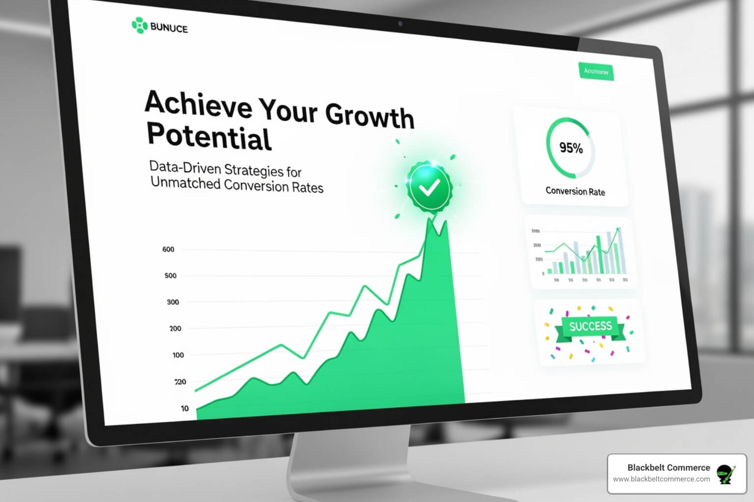
Why High-Converting Websites Matter More Than Ever
High converting websites are engineered to turn visitors into customers. In a competitive digital market, attracting traffic is only half the battle; your site must persuade visitors to take action.
Key facts about high-converting websites:
- Conversion Rate: The percentage of visitors who complete a goal (e.g., purchase, sign-up).
- Industry Average: Most websites convert between 2-5% of their traffic.
- Top Performers: The best sites achieve conversion rates of 10% or more.
- Essential Elements: Clear value propositions, intuitive navigation, fast load times, and compelling CTAs are non-negotiable.
- Mobile Optimization: Crucial, with over 55% of web traffic coming from mobile devices.
Consider this: improving your conversion rate from 2% to 4% doubles your revenue from the same amount of traffic, without increasing your ad spend. This is the power of conversion optimization. The difference between a low and high-performing site lies in details like CTA placement, headline wording, and page speed.
With global eCommerce sales projected to hit $6 trillion, your website must be a top performer. Every visitor is an investment, and a high-converting site ensures that investment yields returns.
I’m Cesar A Beltran, founder of Blackbelt Commerce. For over 15 years, I’ve helped more than 1,000 businesses build high converting websites with strategic Shopify development. This guide shares the proven techniques that separate average sites from conversion powerhouses.

High converting websites terms at a glance:
The Core Elements of High-Converting Websites
High-converting sites are not accidental; they are the product of deliberate design, strategic planning, and a deep understanding of user psychology. A website that looks beautiful but converts poorly is a common problem. The solution lies not in flashy trends, but in mastering the fundamentals.
This section breaks down the essential components that turn a standard website into a powerful conversion tool. These principles are universal, whether you run a small Shopify store or a large enterprise site.
The core elements of a high-converting website work in harmony to create a seamless user journey. Getting them right means building a revenue-generating machine that operates 24/7. Let’s explore how to implement each one.
1. Intuitive UX and Flawless Navigation
A confusing website is like a maze-like store—visitors will leave out of frustration. This is why user experience (UX) is a secret weapon for better conversions. Good UX makes every interaction feel natural and effortless.
Jakob’s Law states that users prefer your site to work the same way as all the other sites they already know. Familiar design patterns create instant comfort and reduce the learning curve. This makes simple navigation essential. Visitors should never need a map to find what they’re looking for.
Key principles for intuitive UX include:
- Visual Hierarchy: Use size, color, and placement to guide the visitor’s eye to the most important elements, like key messages and CTAs.
- Ample White Space: This “breathing room” improves readability and can increase user comprehension by nearly 20%.
- F-Shaped Pattern: Most users scan web pages in an F-shape. Place your most critical content along this path for maximum visibility. You can see this demonstrated in this F-shaped pattern heatmap.

At Blackbelt Commerce, we integrate these principles into every Shopify store, creating sites that are both beautiful and incredibly easy to use. This ensures visitors can find what they need and take action without friction.
2. Crystal-Clear Value Proposition & Messaging
You have about three seconds to answer a visitor’s most important question: “Why should I care?” Your unique value proposition (UVP) must provide a clear, immediate answer.
High-performing sites instantly communicate what they offer and how it improves the customer’s life. Avoid vague corporate jargon; be direct and benefit-focused. Your UVP isn’t about product features, but about the outcome you provide. Customers don’t buy a drill, they buy a hole in the wall.
Your messaging should be built on:
- Compelling Headlines: Instead of “Premium Business Solutions,” use a results-oriented headline like, “Cut Your Admin Time in Half.”
- Addressing Pain Points: Show that you understand your customer’s frustrations and have the solution they’re searching for.
- Benefit-Oriented Language: Every piece of copy should reinforce how you solve the customer’s problem.
At Blackbelt Commerce, we craft messaging that connects, resonates, and converts browsers into buyers by focusing on the value you deliver.
3. Irresistible Calls-to-Action (CTAs)
A call-to-action (CTA) is the crucial step that turns a visitor’s interest into a conversion. On high-performing websites, CTAs are carefully crafted invitations that guide users to the next step.
To create effective CTAs, focus on:
- Contrasting Colors: Your CTA button must stand out. If your site uses cool blues, a vibrant orange button will grab attention. A simple color change can significantly increase conversions.
- Action-Oriented Text: Avoid generic words like “Submit.” Use exciting, benefit-driven phrases like “Get Your Free Quote” or “Start My 30-Day Trial” to create a sense of ownership and clarity.
- Strategic Placement: Place your primary CTA “above the fold” (visible without scrolling). Add secondary CTAs further down the page, but avoid creating decision paralysis with too many options. For landing pages, a 1:1 attention ratio (one goal, one CTA) is often best.
- A/B Testing: Continuously test variations of your CTAs—wording, color, size, and placement—to find what resonates most with your audience. This data-driven approach is key to improving performance.
More info about our Shopify web design services shows how we craft every element for maximum impact.
4. Blazing-Fast Speed and Mobile-First Design
Speed is critical. Most users will abandon a site that takes more than three seconds to load. A mere one-second delay can reduce conversions by 7%. For top-performing websites, speed isn’t just a feature; it’s a requirement. At Blackbelt Commerce, we aim for a 2-3 second load time by optimizing images, streamlining code, and using content delivery networks.
Equally important is mobile performance. Mobile devices account for 55-60% of global internet traffic, and 83% of landing page visits. If your site isn’t optimized for mobile, you’re ignoring the majority of your audience.
A mobile-first design isn’t just a shrunken-down desktop site. It involves rethinking the experience for smaller screens and touch-based interaction. This means simplified navigation, large tap-friendly buttons, and streamlined forms. Nearly 60% of consumers report mobile shopping is important when choosing a business, and they expect a fast, seamless experience.

We build every Shopify solution with a mobile-first philosophy, designing for the smallest screen first and scaling up. This ensures an optimal experience for all users, no matter their device. On conversion-focused websites, speed and mobile optimization are the foundation for success.
5. Building Trust with Social Proof
Buying from an unfamiliar website feels risky. Social proof is the antidote. It shows potential customers that real people have purchased from you and were happy with the results. Successful websites use the voices of satisfied customers to build credibility and reduce visitor anxiety.
The impact is significant: 84% of people trust online reviews as much as personal recommendations.
Effective forms of social proof include:
- Customer testimonials (with names and photos)
- Product reviews and star ratings
- Client logos of recognizable brands
- Case studies detailing success stories
- Trust badges (security seals, payment provider logos)
Placement is key. A testimonial near a CTA or reviews featured prominently on a product page can be the final nudge a customer needs.

At Blackbelt Commerce, we strategically weave these trust signals throughout the customer journey, changing hesitant browsers into confident buyers.
6. Engaging Visitors with Live Chat
A last-minute question can easily lead to an abandoned cart. Live chat prevents this by providing immediate answers, acting as a virtual sales assistant at the perfect moment.
For conversion-focused websites, live chat is essential. In fact, 41% of customers expect to see live chat on a website. It offers real-time support that can be the difference between a sale and a lost customer.
The results are compelling: businesses using live chat can see a 48% increase in revenue per chat hour and a 40% higher conversion rate. It removes friction from the buying process by answering questions about products, shipping, or policies on the spot.
Beyond boosting sales, live chat builds a human connection, showing visitors there are real people ready to help. At Blackbelt Commerce, we often integrate live chat solutions to turn hesitant browsers into confident buyers. Modern tools can even use chatbots for after-hours support and proactive engagement.
Measuring, Testing, and Optimizing for Conversion
High-performing websites are never “finished.” They require constant attention and refinement. The most successful online businesses treat conversion optimization as an ongoing practice, not a one-time project. The difference between a 2% and a 10% conversion rate often lies in dozens of small, data-driven improvements made over time. This section covers how to measure what matters, understand user behavior, and test changes to continuously improve your site’s performance.
How to Calculate and Track Your Conversion Rate
You can’t improve what you don’t measure. Your conversion rate is calculated with a simple formula: (Total Conversions / Total Visitors) * 100. For example, 100 purchases from 5,000 visitors is a 2% conversion rate.
It’s important to track two types of conversions:
- Macro-conversions: These are your primary goals, like a completed purchase or a lead submission. They directly impact your bottom line.
- Micro-conversions: These are smaller actions that indicate user engagement, such as a newsletter sign-up, adding an item to the cart, or downloading a guide.
Tracking both is crucial. Micro-conversions act as early warning signals. A drop in “add-to-cart” actions, for instance, can help you pinpoint a problem in your sales funnel before it severely impacts your macro-conversions. We set up comprehensive tracking for both from day one on all Shopify projects.
Understanding User Behavior on High-Converting Websites with Analytics
Analytics tell you what is happening, but not why. To build better-performing sites, you need to dig deeper. While Google Analytics provides foundational data on traffic and drop-off points, other tools offer crucial qualitative insights.
- Heatmaps: These show where users click, scroll, and focus their attention, revealing if critical elements are being ignored.
- Session Recordings: Watching anonymous user sessions is like having a 24/7 focus group. You can see exactly where users get confused or encounter friction.
Combining quantitative data (the “what”) with qualitative insights (the “why”) provides a complete picture of user behavior. This evidence-based approach informs every optimization decision we make. Leverage Analytics for Continuous Improvement and complement your efforts with our Shopify SEO services.
The Power of A/B Testing and Experimentation
A/B testing (or split testing) turns user behavior insights into revenue. It’s the scientific method for web design: create two versions of an element (e.g., a headline or CTA button), show them to different audience segments, and let the data decide the winner. This data-driven approach removes guesswork and opinions from the optimization process.
You can test nearly anything: headlines, CTA colors, images, page layouts, and more. For one client, changing a CTA button from green to orange increased conversions by 34%. For another, a series of A/B tests on their homepage headline and CTA increased conversions by 31%, avoiding a costly full redesign.
The power of A/B testing lies in data-driven iteration. Small, consistent improvements create a compounding effect that steadily increases your conversion rate. The key is to test one element at a time and wait for statistically significant results. Learning How to do A/B testing correctly is crucial for generating meaningful insights.
Real-World Examples of High-Converting Websites
Seeing conversion principles in action is the best way to understand their power. Here are three diverse businesses that have mastered the art of building high-converting sites.
Example 1: Mint (Simplicity in Finance)
Mint makes personal finance feel approachable by stripping away complexity. Its site uses a clean, anxiety-free design to put visitors at ease. The value proposition is instantly clear, and high-contrast CTA buttons like “Sign Up Free” are impossible to miss, guiding users toward conversion.

Mint proves that even complex services can be presented simply. Visit Mint’s website to see their approach.
Example 2: Skillshare (Engaging Learning Platform)
Skillshare makes online education feel exciting. Its site uses a dark color scheme that makes its mint green standout CTA colors pop. Instead of listing technical features, the site highlights creative classes with engaging imagery and encourages browsing, turning the user experience into an exploration of possibilities.
Visit Skillshare’s website to see how they make learning irresistible.
Example 3: Rookwood (Visual Storytelling in eCommerce)
Rookwood, a pottery company, overcomes the challenge of selling physical products online through exceptional visual storytelling. Their site features high-quality product images that showcase the texture and artistry of each piece. A muted color scheme and ample white space ensure the products are the focal point. This product-focused design lets the craftsmanship speak for itself.

Rookwood shows that in eCommerce, superior visual storytelling is a powerful conversion tool. Visit Rookwood’s website to see it in action.
These examples show that high-converting websites all share a deep understanding of their audience and a commitment to removing friction from the user journey.
Frequently Asked Questions about Website Conversion
Here are answers to common questions about building a conversion-focused website.
What is a good conversion rate for an eCommerce website?
While the average eCommerce conversion rate is 2-5%, a “good” rate depends on your industry, audience, and product price point. Some industries see averages as high as 12.3%, while others are closer to 1-3%. Rates above 5% are generally considered strong, with top performers hitting 10% or more. The best approach is to benchmark against your own past performance and strive for continuous growth.
How long does it take to see results from conversion rate optimization (CRO)?
Results vary. Small changes, like A/B testing a CTA button, can show results in days or weeks with enough traffic. Larger strategic changes, such as a full redesign, may take several months to fully measure. CRO is an ongoing process of continuous improvement, not a one-time fix.
What’s the difference between a landing page and a homepage?
They serve different purposes:
- Homepage: The main entry point to your site, designed for broad exploration. It’s a hub that directs users to various sections.
- Landing Page: A standalone page for a specific marketing campaign with a single, focused goal (e.g., capturing a lead). It has minimal navigation to keep the user focused on the call-to-action.
Conclusion: Turn Your Website into a Conversion Machine
Building a conversion-focused website is an ongoing commitment. We’ve covered the essentials: intuitive navigation, clear value propositions, compelling CTAs, fast load times, mobile-first design, and trust-building social proof. When these elements work in harmony, your website transforms from a digital brochure into a 24/7 conversion machine.
Every detail matters—from button color to page speed. The most successful sites never stop evolving; they rely on data, testing, and continuous improvement. Improving your conversion rate is about making your existing traffic work smarter, not just spending more on ads.
For Shopify merchants, this is where expertise makes the difference. At Blackbelt Commerce, we’ve spent over 15 years creating conversion-focused eCommerce solutions. We don’t just build beautiful stores; we build custom Shopify sites designed to turn visitors into customers.
Your website has immense potential. With the right strategy and continuous optimization, it can become your most powerful sales tool. Ready to open up that potential? Contact us for a custom Shopify solution and let’s build a conversion powerhouse together.
Quick Answer: High converting websites
High-converting websites make it easy for the right visitor to understand the offer, trust the brand, compare options, and take action. For Shopify merchants, conversion quality depends on mobile UX, page speed, product storytelling, reviews, navigation, checkout confidence, analytics, and a clear path to purchase or a strategy call.
Want a sharper Shopify growth plan?
If this article connects to a current store decision, use the calendar to book a strategy call and turn the idea into a practical plan.
Key Takeaways
- Conversion work should diagnose the full journey from traffic quality to product clarity, cart behavior, and checkout confidence.
- Strong optimization uses analytics and customer behavior rather than random visual changes or unnecessary apps.
- Better CTAs, trust signals, mobile UX, speed, and product storytelling can improve both purchases and lead generation.
- Internal links should reinforce Shopify CRO, custom development, Shopify experts, and Shopify Plus agency support.
- The same-page Calendly CTA should give qualified readers a low-friction way to discuss a store-specific improvement plan.
How this connects to your Shopify growth strategy
This article should remain useful for readers researching High converting websites, but it also needs to show when the topic becomes a business decision. For the Shopify Growth, CRO, and Store Optimization cluster, the commercial bridge is practical: once the reader understands the concept, the next step is deciding whether their current Shopify setup can support the desired experience, conversion path, and operational workflow. That is where expert planning, design, development, CRO, and SEO support can turn the idea into measurable store improvements.
Want a sharper Shopify growth plan?
Use this guide as a decision tool. Then book a strategy call when you want a practical roadmap for your store.
Related Shopify resources
These internal resources support the Shopify Growth, CRO, and Store Optimization topic cluster and help connect this guide to stronger commercial next steps:
- Shopify CRO
- Shopify experts
- Shopify Plus agencies
- Shopify CRO — Parent service page for the reader’s next commercial step
- Blackbelt Commerce — Home-page authority link for brand and core Shopify expertise
- Shopify experts — Money-page link requested for expert-hiring intent
- Shopify Plus agencies — Money-page link requested for high-growth and Plus-agency intent
- Shopify custom development — Development service page for implementation and technical help
- Shopify checkout optimization — Related conversion article
- Shopify conversion optimization — Related CRO article
Questions store owners ask before taking action
What improves Shopify conversion rates?
Common levers include speed, mobile UX, product-page clarity, reviews, trust signals, navigation, cart behavior, checkout confidence, and offer quality.
How should a store owner prioritize CRO work?
Use analytics, customer behavior, revenue impact, and implementation effort to decide which friction points to fix first.
Can CTAs affect conversion?
Yes. Clear CTAs reduce hesitation by telling qualified visitors what to do next, whether that is buying, requesting help, or booking a strategy call.
When should CRO involve experts?
Expert help is useful when conversion issues are tied to theme code, apps, analytics, product strategy, checkout friction, or revenue-critical pages.
How should this article lead to a call?
It should help readers identify friction and then offer a same-page booking option for a store-specific improvement plan.
Future articles needed for topical dominance
To build deeper topical authority around this cluster, these supporting topics should be created later and linked back into this article:
- High Converting Websites Checklist for Shopify Store Owners: Creates a practical support article that turns the Shopify Growth, CRO, and Store Optimization topic into an actionable review tool.
- Common High Converting Websites Mistakes and How to Avoid Them: Captures problem-aware searches and gives BBC a natural place to explain implementation risks without hard selling.
- When to Hire Shopify Experts for High Converting Websites: Connects informational demand to the expert-hiring money page while preserving educational intent.
Want a sharper Shopify growth plan?
Ready to turn the advice in this article into an action plan? Open the calendar here and choose a time that works for you.