


Blog updated with the most recent Shopify and eCommerce strategies on 05/02/2026.
Mobile-First Shopify Themes for Peak Sales: Your Essential Guide to Ecommerce Mobile Mastery
With mobile commerce projected to command over 60 percent of all online retail by 2025, selecting mobile-friendly Shopify themes isn’t just an option—it’s a critical sales engine. Store owners who overlook responsive design risk sluggish load times, frustrated shoppers, and abandoned carts. This comprehensive guide breaks down essential definitions, performance strategies, top-tier theme recommendations, and conversion-boosting tactics. We’ll cover why responsiveness is paramount, the must-have features of high-performance themes, leading mobile-optimized choices, speed and user experience enhancements, conversion rate optimization (CRO) best practices, how Blackbelt Commerce elevates your mobile presence, ongoing performance monitoring, and the cutting-edge design trends shaping the future.
Why Mobile Responsiveness is Non-Negotiable for Shopify Stores
Mobile responsiveness means every single element—from your main navigation to your product images—seamlessly adapts to fit any handheld screen. This ensures your customers can browse, add items to their cart, and complete purchases without any awkward pinch-zooming or frustrating horizontal scrolling. A responsive Shopify store significantly boosts accessibility, improves search engine visibility, builds trust, and directly impacts your bottom line.
What Are the Latest Mobile Commerce Trends Driving Shopify Sales?

The mobile commerce landscape is rapidly evolving, with progressive web apps (PWAs), voice-activated shopping, and streamlined in-app checkout flows leading the charge. PWAs deliver app-like speed and accessibility directly through the web, slashing bounce rates and enabling powerful re-engagement via push notifications. Voice search, powered by digital assistants, makes product discovery faster than ever, while single-page mobile checkouts can slash cart abandonment by up to 35 percent by removing friction. As personalization becomes the norm, dynamic content tailored to individual shopper behavior drives higher average order values and fosters deep loyalty among mobile-first customers, setting the stage for the crucial SEO and UX improvements we’ll explore next.
Mobile Commerce: The Definitive Future of Online Shopping in 2025
Mobile commerce is poised to dominate the future of online shopping, fueled by widespread smartphone adoption, enhanced connectivity, and the convenience of app-based purchasing. Key trends include AI-driven personalization, augmented reality (AR) experiences, and the widespread use of mobile wallets.
This citation provides essential context for the article’s deep dive into mobile commerce trends and their direct impact on Shopify sales performance.
How Does Google’s Mobile-First Indexing Impact Your Shopify SEO?
Google’s mobile-first indexing means your Shopify store’s mobile version is now the primary source Google uses to evaluate and rank your site. If your current theme fails to display crucial content or meta tags correctly on mobile devices, your search engine performance can plummet, severely damaging your organic visibility. Ensuring all headings, alt text, and structured content render flawlessly on smartphones is vital for maintaining search authority, which directly translates into the conversions that responsive themes unlock.
Mobile-First Indexing: Everything You Absolutely Need to Know
Google’s practice of prioritizing the mobile version of a website for indexing and ranking is known as mobile-first indexing. This fundamental shift underscores the critical importance of mobile-friendly design and content for online success.
This directly reinforces the article’s core message about the indispensable role of mobile responsiveness for Shopify stores and its profound effect on SEO outcomes.
How Does a Superior Mobile User Experience Drive Conversion Rates?
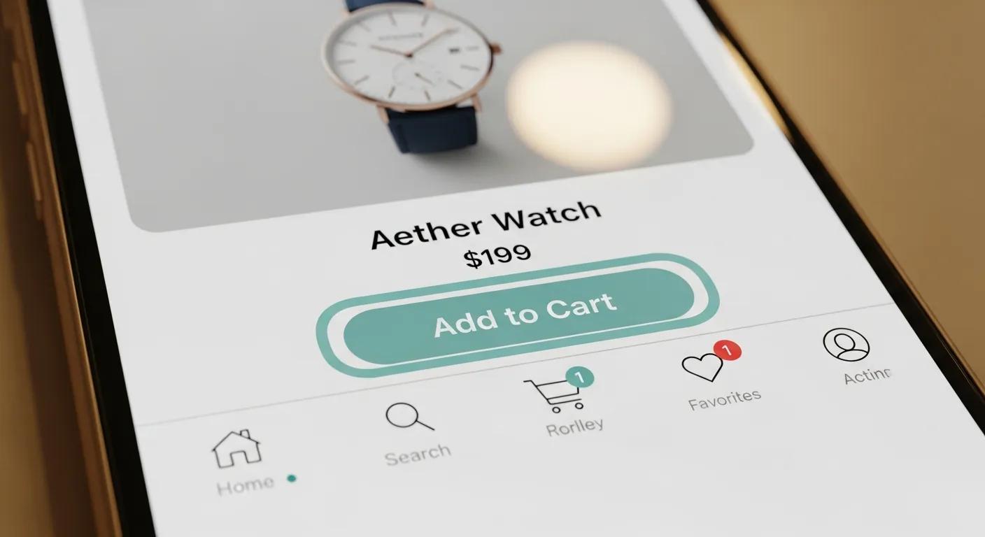
An exceptional mobile user experience acts as a seamless bridge between product discovery and the final purchase, eliminating frustrating obstacles like minuscule buttons or confusing menu structures. When your pages load in under two seconds and your checkout process is crystal clear, conversion rates can surge by up to 20 percent. Intuitive touch targets, persistent “Add to Cart” bars, and mobile-optimized product galleries expertly guide shoppers from browsing to buying. These UX improvements, which we’ll detail in later sections, are absolutely essential for driving sales growth.
Top-Tier Best Practices for Mobile CRO
Mastering mobile conversion rate optimization (CRO) is absolutely critical for businesses aiming to maximize their conversions. Key strategies include aggressively improving page speed, designing truly responsive layouts, and simplifying navigation to its core elements.
This citation directly supports the article’s in-depth discussion of mobile CRO strategies and essential best practices specifically for Shopify stores.
What Are the Defining Features of High-Performance Responsive Shopify Themes?
High-performance mobile themes masterfully blend adaptive layouts, lightning-fast resource loading, and streamlined purchase flows to deliver both stunning visual appeal and exceptional speed. These themes are built upon robust responsive grid systems, employ lazy-loading for assets, and feature intuitive mobile navigations that perfectly align with your brand identity while being optimized for thumbs and taps.
Which Responsive Design Principles Guarantee Seamless Mobile Compatibility?
Effective responsive design hinges on flexible grid systems, fluid images, and sophisticated media queries that dynamically adjust breakpoints for a wide spectrum of screen widths. By employing CSS flexbox or grid systems, you ensure that all components resize proportionally. Utilizing vector-based icons and SVG assets prevents pixelation, guaranteeing that product images, text blocks, and call-to-action buttons render legibly on every device. This meticulous approach creates a consistent and delightful shopping journey across all smartphones and tablets.
How Does Page Speed Optimization Supercharge Mobile Shopify Performance?
Page speed optimization is the art of reducing file sizes, minimizing server requests, and eliminating rendering bottlenecks to dramatically accelerate load times. Critical techniques include compressing images to the efficient WebP format, deferring non-essential JavaScript execution, and intelligently leveraging browser caching.
Reducing LCP and FID on mobile not only satisfies Google’s Core Web Vitals but also delivers immediate, tangible improvements in shopper engagement, naturally leading into the exciting innovations in checkout processes.
Why Are Intuitive Mobile Navigation and Checkout Absolutely Essential for Sales?
Considering the natural thumb-reach pattern on small screens, bottom-anchored menus and easily swipeable carousels consistently outperform top-aligned navigation elements. A simplified checkout process, featuring autofill capabilities, guest checkout options, and a clear progress indicator, significantly reduces cognitive load. By guiding shoppers through three or fewer steps, you dramatically minimize friction and combat cart abandonment—a topic we’ll revisit when exploring advanced conversion optimization techniques.
Which Shopify Themes Stand Out as the Best Optimized for Mobile Devices?
Selecting the ideal theme requires a careful balance of customization potential, raw performance, and budget considerations. Mobile-optimized Shopify themes must load with exceptional speed, support flexible feature toggles, and adapt content blocks effortlessly without demanding manual CSS adjustments.
What Distinguishes Free from Paid Mobile Shopify Themes?
Free themes typically provide essential responsiveness, basic section layouts, and core Shopify integration without any licensing fees. In contrast, paid themes offer advanced customization panels, built-in A/B testing capabilities, premium dedicated support, and performance enhancements like pre-configured CDNs. Paid options often include meticulously optimized code for accelerated mobile pages and dynamic filtering functionalities that are typically absent in free themes.
How Does Headless Commerce Revolutionize Mobile Shopify Experiences?
Headless commerce fundamentally decouples your frontend presentation layer from your backend logic, empowering you to create custom mobile apps or PWAs delivered seamlessly via APIs. This advanced architecture results in significantly faster page loads—as only the necessary JSON payloads are transferred—while granting complete creative control over your design. By embracing headless architecture, brands can integrate sophisticated personalization engines and native-style animations that elevate mobile engagement far beyond the limitations of traditional themes.
What Are the Top Mobile-Friendly Shopify Themes Recommended for 2024?
- Dawn Pro – Features a lightweight framework with advanced image lazy loading and integrated animation controls.
- Turbo – Engineered for ultra-fast loading, offering predictive search and rich, dynamic mobile menus.
- SpeedFly – PWA-ready with robust offline caching and push notification capabilities.
- Motion Max – Boasts dynamic content blocks, automatic video resizing, and a convenient bottom toolbar for streamlined checkout.
The Best Shopify Themes for Mobile-First eCommerce Stores
Choosing the right theme is absolutely paramount for ensuring your site performs exceptionally well on mobile devices. A true mobile-first design philosophy guarantees that your website functions flawlessly across all screen sizes and device types.
This citation strongly supports the article’s guidance on selecting the most effective mobile-friendly Shopify themes.
How Can Shopify Mobile Speed Optimization Techniques Directly Boost Your Sales?
Faster mobile experiences translate directly into significantly lower bounce rates and demonstrably higher conversion rates. Advanced techniques like optimizing all assets, minifying code, and implementing selective loading ensure your pages render almost instantaneously, compelling shoppers to explore further and confidently complete their purchases.
What Are the Most Effective Image Optimization Strategies for Mobile Shopify?
Images typically constitute over 50 percent of a webpage’s total weight. Converting standard JPEGs to the highly efficient WebP format, serving responsive image sets using `srcset`, and employing lazy loading for off-screen visuals drastically reduce initial load times. Implementing image CDNs with on-the-fly resizing capabilities further cuts down on bandwidth consumption. By meticulously optimizing your product, collection, and banner images, you accelerate rendering and deliver polished, professional visuals without compromising speed.
How Does Code Minification Elevate Mobile Theme Performance?
Minification is the process of removing unnecessary whitespace, comments, and redundant code from HTML, CSS, and JavaScript files, effectively shrinking file sizes by up to 30 percent. Bundling scripts and styles together further reduces the number of HTTP requests the browser needs to make. The end result is a leaner, more efficient mobile code bundle that executes much faster on slower cellular connections, crucially sustaining shopper attention and minimizing interaction delays.
Which Tools Are Indispensable for Monitoring and Improving Shopify Mobile Speed?
Regular, in-depth performance audits rely heavily on a suite of specialized tools:
- Google PageSpeed Insights for comprehensive lab and real-world field data on Core Web Vitals.
- Lighthouse for accurate simulation of mobile environments and precise identification of render-blocking resources.
- WebPageTest for rigorous testing of mobile performance across a wide array of device profiles and network conditions.
- GTmetrix for detailed waterfall charts and granular resource breakdowns.
15 Essential Shopify Mobile Optimization Tips to Elevate User Experience
Optimizing images, ensuring accessible navigation, and streamlining the entire checkout process are paramount to significantly enhancing the user experience on Shopify mobile stores.
This citation directly supports the article’s valuable discussion on effective Shopify mobile optimization tips.
How Can You Strategically Increase Mobile Conversion Rates on Shopify?
Optimizing for mobile conversion involves meticulously refining every single touchpoint—from the initial product discovery phase right through to the final checkout. By enhancing checkout flows, perfecting product pages, and implementing persuasive elements, you can transform casual browsers into loyal, repeat buyers.
What Are the Absolute Best Practices for Mobile Checkout Optimization?
A streamlined mobile checkout experience combines the convenience of autofill, a minimal number of form fields, and a persistent, clear progress bar. Integrating popular digital wallets like Apple Pay or Google Pay drastically reduces the need for manual data entry. Clearly labeled buttons, accessible guest checkout options, and prominent trust badges displayed at each step reinforce credibility and security. These practices collectively cut friction and significantly bolster conversion rates, even within mobile constraints.
10 Essential Best Practices to Optimize Your Mobile Checkout for a User-Friendly Experience
Optimizing the mobile checkout process is absolutely essential for delivering a smooth and satisfying customer journey. Key best practices include adopting a mobile-first design approach, utilizing clear calls-to-action (CTAs), and offering multiple convenient payment options.
This citation directly supports the article’s discussion on best practices for mobile checkout optimization.
How Should Mobile Product Pages Be Expertly Designed for Maximum Conversion?
Product pages meticulously optimized for mobile feature high-resolution hero images that support pinch-to-zoom functionality, concise bullet-point overviews for quick scanning, and persistent “Add to Cart” bars that remain visible. Displaying limited but highly relevant cross-sells below the fold strategically encourages upsells without overwhelming the shopper. This simplified, focused layout keeps the shopper’s attention squarely on the purchase decision and intuitively guides their thumb toward conversion.
Which Mobile CRO Strategies Deliver Measurable and Significant Sales Growth?
Highly effective mobile CRO tactics include:
- A/B Testing Mobile Layouts to definitively identify the highest-performing design elements and user flows.
- Strategic Exit-Intent Popups that present compelling discount offers when shoppers signal their intent to leave.
- Leveraging Social Proof Widgets such as real-time purchase notifications to build confidence.
- Simplifying Navigation (Hamburger vs. Tab Bar) based on in-depth analytics heatmaps and user behavior data.
10 Top CRO for Mobile Strategies to Skyrocket Conversions
Conversion Rate Optimization (CRO) specifically for mobile involves enhancing a mobile website or app to significantly increase the number of visitors who complete desired actions. Effective mobile CRO strategies encompass optimizing navigation, streamlining the checkout process, and implementing robust responsive design.
This citation strongly supports the article’s exploration of mobile CRO strategies and actionable methods for increasing conversion rates.
How Does Blackbelt Commerce Guarantee Your Shopify Store Is Mobile-Ready?
Blackbelt Commerce harnesses over a decade of specialized Shopify expertise to deliver mobile themes that perfectly balance cutting-edge aesthetics, peak performance, and proven conversion science. As dedicated Blackbelt Commerce – Shopify Experts – Ecommerce Development partners, we deploy proprietary audit methodologies, custom design solutions, and advanced optimization workflows to elevate mobile experiences and drive measurable, impactful sales growth.
What Bespoke Mobile Theme Development Services Does Blackbelt Commerce Provide?
Our expert team crafts completely bespoke, responsive themes from the ground up, meticulously tailoring grid systems, navigation patterns, and content blocks to precisely match your brand’s unique voice and identity. We seamlessly integrate dynamic features—such as live product filtering and sticky add-to-cart bars—while rigorously enforcing performance best practices. This ensures that every mobile shopper receives a fast, frictionless, and engaging journey perfectly aligned with your core business objectives.
How Do Performance Audits and Optimization Services Dramatically Improve Mobile Sales?
Through comprehensive, in-depth mobile performance audits, we meticulously pinpoint critical bottlenecks in image delivery, code execution, and user flow pathways. Our specialized optimization services then directly address these issues using advanced techniques like image CDNs, aggressive code minification, and critical CSS inlining. Our clients typically witness a remarkable 25–40 percent reduction in mobile load times, which directly translates into significantly boosted engagement metrics and higher conversion rates.
What Success Stories Showcase Blackbelt Commerce’s Transformative Mobile Optimization Impact?
A prominent global apparel retailer experienced a substantial 30 percent surge in mobile conversion rates and a significant 22 percent uplift in average order value following our custom theme implementation and intensive speed tuning. A niche beauty brand achieved a remarkable 50 percent decrease in their mobile bounce rate after we streamlined their checkout process and refined their overall user experience. These compelling case studies powerfully demonstrate how targeted mobile enhancements translate directly into tangible, revenue-generating gains.
What Are the Most Common Questions About Mobile-Friendly Shopify Themes?
For many store owners navigating the path to mobile excellence, recurring questions arise concerning importance, testing methodologies, platform capabilities, and CRO strategies. Here, we provide clear, concise answers to these core concerns.
Why Is Mobile-Friendliness Absolutely Crucial for Shopify Stores?
Mobile-friendliness is paramount because a majority of online shoppers—well over half—now browse and make purchases using their smartphones. A truly responsive theme guarantees that your content is not only accessible but also engaging on every single device, leading to improved SEO rankings, higher user satisfaction, and ultimately, increased conversion rates by aligning perfectly with Google’s mobile-first indexing priorities.
How Can I Accurately Check If My Shopify Theme Is Mobile-Friendly?
You can effectively test mobile responsiveness by simply resizing your browser window, utilizing Google’s Mobile-Friendly Test tool, or employing the device simulation features within Chrome DevTools. Look for proper scaling of elements, legible text that doesn’t require zooming, and fully interactive navigation menus—these key indicators confirm your theme meets essential mobile usability standards.
Does Shopify Automatically Ensure My Store Is Mobile-Friendly?
While Shopify themes are inherently built with responsive foundations, custom modifications or the integration of third-party apps can sometimes introduce layout inconsistencies or performance issues. Ensuring your images are mobile-optimized, avoiding custom code that might interfere with CSS media queries, and conducting regular cross-device testing are crucial steps to maintain the platform’s built-in responsiveness.
How Can I Effectively Improve Mobile Conversion Rates on Shopify?
Improving mobile conversions involves a strategic focus on optimizing load speed, streamlining the checkout process, simplifying product pages, and incorporating strong trust signals. Implement digital wallets, drastically reduce form fields, meticulously test button placements, and utilize clear, compelling calls-to-action to guide shoppers swiftly and efficiently through the purchase funnel.
CRO for Mobile: Proven Strategies to Boost Mobile Conversions (2024)
Mobile conversion rate optimization (CRO) is the strategic process of enhancing your mobile website’s user experience to significantly increase the number of desired actions taken by visitors. Effective mobile CRO involves deep analysis of mobile user behavior and continuous improvement of site navigation and speed.
This citation directly supports the article’s discussion on mobile CRO and practical methods for boosting conversion rates.
How Can You Continuously Monitor and Enhance Mobile Shopify Performance?
Achieving sustained mobile success requires diligent tracking of key performance indicators, strategic utilization of monitoring tools, and regular auditing of both content and technical code on a consistent cadence.
What Key Performance Indicators (KPIs) Should You Track for Mobile Shopify Success?
- Mobile Conversion Rate to accurately gauge purchase efficiency.
- Bounce Rate on Mobile to quickly detect potential UX issues or friction points.
- Average Session Duration for deep insights into user engagement levels.
- Core Web Vitals (LCP, FID, CLS) to meticulously measure speed, interactivity, and visual stability.
- Cart Abandonment Rate for precise analysis of checkout friction and drop-off points.
These critical indicators reveal valuable optimization opportunities and provide the data needed to guide iterative, data-driven improvements.
Which Tools Are Essential for Ongoing Mobile Optimization and SEO Monitoring?
Tools like Google Search Console are invaluable for tracking mobile search queries and the visibility of rich results, while Google Analytics 4 excels at segmenting and analyzing mobile user behavior. SEMrush or Ahrefs are crucial for monitoring keyword trends and competitor performance, and Lighthouse provides detailed audits to pinpoint frontend issues. Utilizing these platforms in synergy ensures comprehensive oversight of your entire mobile ecosystem.
- Google Search Console
- Google Analytics 4
- SEMrush
- Ahrefs
- Lighthouse
Mobile-First Indexing: What It Truly Means & Best Practices to Follow
Mobile-first indexing signifies that Google prioritizes the mobile version of a website’s content for both indexing and ranking purposes. If a site is not adequately optimized for mobile, it can negatively impact its search result rankings.
This citation powerfully reinforces the critical importance of mobile optimization for SEO, as thoroughly discussed throughout the article.
How Does Regular Content and Technical Auditing Elevate Mobile Sales?
Conducting bi-annual content reviews ensures that product descriptions, alt text, and metadata are consistently refreshed to align with evolving user intent and search trends. Simultaneously, annual technical audits meticulously examine theme updates, app performance, and server response times. This dual-pronged approach keeps your mobile store both highly relevant and exceptionally performant, sustaining strong search visibility and ensuring consistent shopper satisfaction.
What Are the Emerging Trends Shaping Ecommerce Mobile Design for Shopify?
Looking ahead to 2025 and beyond, mobile design is rapidly evolving, focusing on deeper levels of personalization, innovative new payment solutions, and advanced page-acceleration techniques that redefine speed and user engagement.
Mobile Commerce 2025: Key Trends and Their Profound Impact
Anticipated mobile commerce trends for 2025 include the integration of AI, immersive AR experiences, and seamless cross-platform shopping journeys. Modern mobile applications are increasingly prioritizing sleek, intuitive designs and highly personalized product recommendations.
This citation provides valuable forward-looking context for the article’s discussion on emerging trends within the mobile commerce space.
How Is Mobile Personalization Fundamentally Changing Shopify User Experiences?
Mobile personalization leverages a deep understanding of browsing history, geolocation data, and past purchase behavior to dynamically surface relevant product recommendations, tailor home screens, and deliver personalized pop-up offers. These highly targeted micro-experiences significantly boost relevance and drive repeat purchases by creating a truly one-to-one shopping journey on smartphones.
Mobile Personalization: The Ultimate Retail Strategy
Mobile personalization stands out as the single most crucial strategy for retailers to adopt, as modern shoppers now expect personalized experiences at every single touchpoint. Shopify’s robust platform is instrumental in centralizing and connecting these interactions across all channels.
This citation strongly supports the article’s emphasis on mobile personalization and its critical importance for modern ecommerce success.
What New Mobile Payment Options Are Now Available for Shopify Stores?
Beyond the widely adopted Apple Pay and Google Pay, Shopify now seamlessly supports buy-now-pay-later (BNPL) solutions like Klarna and Afterpay, cryptocurrency checkouts via direct wallet integrations, and popular regional mobile wallets such as Alipay or WeChat Pay. Offering a diverse range of frictionless payment methods effectively caters to the varied preferences of mobile buyers and significantly expands your global reach.
How Will Accelerated Mobile Pages (AMP) Impact Shopify Mobile Speed?
AMP introduces a highly streamlined HTML framework designed to load almost instantaneously by caching pages directly on Google’s servers. While AMP can significantly boost mobile visibility and keep users engaged, integrating it effectively with Shopify requires careful management of dynamic cart functionalities and third-party scripts. The next generation of AMP-like frameworks promises even tighter integration between performance and conversion, signaling a definitive shift toward ultra-fast mobile storefronts.
Achieving a high-performing, truly mobile-friendly Shopify store demands a comprehensive, holistic strategy that encompasses selecting the right responsive theme, implementing rigorous performance optimization, employing sophisticated conversion engineering, and committing to continuous monitoring. By diligently applying these strategies and partnering with specialized ecommerce experts, ambitious merchants can effectively transform mobile traffic into consistent, sustainable growth and cultivate lasting customer loyalty.
Quick Answer: Mobile friendly Shopify themes
Mobile friendly Shopify themes help shoppers browse, compare, trust, and buy from smaller screens without friction. The best mobile theme supports fast loading, clear navigation, readable content, strong product media, trust signals, app compatibility, and a checkout path that feels easy on real devices.
Key Takeaways
- Mobile friendly Shopify themes should support speed, navigation, product clarity, readable content, trust, and checkout confidence on real devices.
- The article should connect mobile UX to conversion instead of treating mobile friendliness as a design checkbox.
- Internal links should connect mobile theme decisions to Shopify CRO, landing page design, Shopify experts, Shopify Plus agencies, and custom development.
- The commercial bridge should show when mobile friction deserves expert UX, CRO, or development review.
- Use the same-page Calendly CTA so qualified merchants can book a strategy call without being pushed into a long form.
How this connects to your Shopify growth strategy
This article should remain useful for readers researching Mobile friendly Shopify themes, but it also needs to show when the topic becomes a business decision. For the Shopify Design & CRO cluster, the commercial bridge is practical: once the reader understands the concept, the next step is deciding whether their current Shopify setup can support the desired experience, conversion path, and operational workflow. That is where expert planning, design, development, CRO, and SEO support can turn the idea into measurable store improvements.
Related Shopify resources
These internal resources support the Shopify Design & CRO topic cluster and help connect this guide to stronger commercial next steps:
- Shopify CRO
- Shopify experts
- Shopify Plus agencies
- Shopify CRO — Parent service page for the reader’s next commercial step
- Blackbelt Commerce — Home-page authority link for brand and core Shopify expertise
- Shopify experts — Money-page link requested for expert-hiring intent
- Shopify Plus agencies — Money-page link requested for high-growth and Plus-agency intent
- Shopify custom development — Development service page for implementation and technical help
- Shopify checkout optimization — Related conversion article
- Shopify conversion optimization — Related CRO article
Questions store owners ask before taking action
What makes a Shopify theme mobile friendly?
A mobile-friendly Shopify theme loads quickly, keeps navigation simple, makes product information easy to scan, supports thumb-friendly buttons, and keeps the cart path clear on smaller screens.
Why does mobile theme quality matter for conversion?
Many shoppers browse and compare products on mobile, so weak spacing, slow pages, hard-to-tap buttons, or confusing product layouts can turn qualified traffic into abandoned sessions.
Should merchants choose a theme only because it looks good on mobile?
No. Visual design matters, but merchants should also review speed, product-page flexibility, app compatibility, accessibility, content sections, and how easily the theme can support future CRO work.
When should mobile theme work involve Shopify experts?
Expert help is useful when mobile friction affects sales, when the theme needs custom sections, or when performance, navigation, apps, and conversion strategy need to be improved together.
How should this article lead to a strategy call?
It should help readers identify mobile UX problems, then invite them to book a strategy call when they need a practical roadmap for improving theme performance and conversion.
Future articles needed for topical dominance
To build deeper topical authority around this cluster, these supporting topics should be created later and linked back into this article:
- Mobile Shopify Theme Audit Checklist for UX and Conversion: Creates a practical support article that turns mobile theme research into a conversion-focused review workflow.
- Shopify Mobile Product Page Design: Spacing, CTAs, and Trust Signals: Builds topical authority around mobile product-page UX and creates natural links to Shopify CRO and expert support.
- When to Hire Shopify Experts for Mobile Theme Improvements: Connects mobile UX education to expert implementation while keeping the article useful and lead-generation focused.

